Use Baseline Shift to move a selected character up or down relative to the baseline of the surrounding text. This option is especially useful when you’re hand-setting fractions or adjusting the position of inline graphics.

Note
To increase or decrease the value, click in the Baseline Shift box, and then press the Up or Down Arrow key. Hold down Shift while you press the Up or Down Arrow key to change the value in greater increments.
To change the default increment for baseline shift, specify a value for Baseline Shift in the Units & Increments section of the Preferences dialog box.
When you choose Superscript or Subscript, a predefined baseline shift value and type size are applied to the selected text.
The values applied are percentages of the current font size and leading, and are based on settings in the Type Preferences dialog box. These values do not appear in the Baseline Shift or Size boxes of the Character panel when you select the text.
Note
You can change the default size and position of superscripts and subscripts using Advanced Type preferences.
The default weight of an underline and strikethrough depends on the size of the type.
Jeff Witchel provides a video tutorial about underlining at Custom Underlines in InDesign.
Creating custom underlining is especially useful when you want to create an even underline below characters of different sizes, or for creating special effects, such as background highlighting.
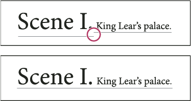
-
Select Underline On or Strikethrough On to turn on underline or strikethrough for the current text.
For Weight, choose a weight or type a value to determine the thickness of the underline or strikethrough line.
For Type, select one of the underline or strikethrough options.
For Offset, determine the vertical position of the line. The offset is measured from the baseline. Negative values move the underline above the baseline and the strikethrough below the baseline.
Select Overprint Stroke when you want to make sure that the stroke doesn’t knock out underlying inks on a printing press.
Choose a color and tint. If you specified any line type other than solid, choose a gap color or gap tint to change the appearance of the area between dashes, dots, or lines.
Select Overprint Stroke or Overprint Gap if the underline or strikethrough will be printed over another color, and you want to avoid errors that can occur with printing misregistration.
Note
To change the underline or strikethrough options in a paragraph or character style, use the Underline Options or Strikethrough Options section of the dialog box that appears when you create or edit the style.
InDesign can automatically insert ligatures, which are typographic replacement characters for certain letter pairs, such as “fi” and “fl,” when they are available in a given font. The characters that InDesign uses when the Ligature option is selected appear and print as ligatures, but are fully editable, and do not cause the spell checker to flag a word erroneously.
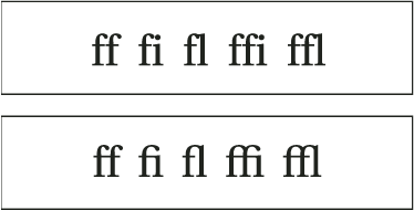
With OpenType fonts, when you choose Ligatures from the Character panel menu, Control panel menu, or in-context menu, InCopy produces any standard ligature defined in the font, as determined by the font designer. However, some fonts include more ornate, optional ligatures, which can be produced when you choose the Discretionary Ligatures command.
You can apply colors, gradients, and strokes to characters and continue to edit the text. Use the Swatches panel and Stroke panel to apply colors, gradients, and strokes to text, or change Character Color settings when creating or editing a style.
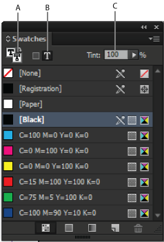
A. Swatch affects fill or stroke B. Swatch affects container or text C. Tint percentage
-
To apply color changes to text inside a frame, use the Type tool
 to
select text.
to
select text.To apply color changes to all text in a frame, use the Selection tool
 to
select the frame. When applying color to the text rather than the
container, make sure that you select the Formatting Affects Text
icon
  in
the Tools panel or in the Swatches panel.
You can also apply a gradient to text by dragging across
the selected text using either the Gradient Swatch tool ![]() or
the Gradient Feather tool
or
the Gradient Feather tool ![]() .
.
Note
To create reverse type, you can change the text fill color to white or [Paper] and the frame’s fill color to a dark color. You can also create reverse type by using a paragraph rule behind text; however, if the rule is black, you’ll need to change the type to white.
You can apply colors and gradients to the stroke and fill of characters with the Swatches panel. For a linked story, you can apply any colors or gradients defined by the linked InDesign layout. For a stand-alone story, you can apply any of the default colors or new colors you create for the document.
Note
You cannot create gradients in InCopy. Gradients only appear when imported from InDesign.
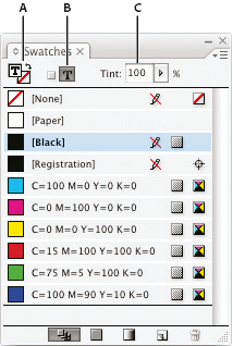
A. Swatch affects fill or stroke B. Swatch affects container or text C. Tint percentage
Note
You can apply colors to text in either Galley, Story, or Layout view; however, color changes are visible only in Layout view.
Use the Effects panel to add transparency effects, such as drop shadows, to text.
Mike Rankin provides examples about transparency effects at InDesign Eye Candy, Part I.
Assigning a language to text determines which spelling and hyphenation dictionary is used. Assigning a language does not change the actual text.
InDesign uses Proximity (and WinSoft for some languages) dictionaries for both spelling and hyphenation. These dictionaries let you specify a different language for as little as a single character of text. Each dictionary contains hundreds of thousands of words with standard syllable breaks. Changing the default language does not affect existing text frames or documents.
You can customize language dictionaries to ensure that any unique vocabulary you use is recognized and treated correctly.
InDesign includes a language locking feature that prevents CJK text from being assigned a non-CJK language.
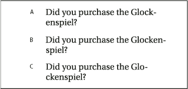
A. “Glockenspiel” in English B. “Glockenspiel” in Traditional German C. “Glockenspiel” in Reformed German
The All Caps or Small Caps commands change the appearance of text, but not the text itself. Conversely, the Change Case command changes the case setting of selected text. This distinction is important when searching or spell-checking text. For example, suppose you type “spiders” in your document and apply All Caps to the word. Using Find/Change (with Case Sensitive selected) to search for “SPIDERS” will not find the instance of “spiders” to which All Caps was applied. To improve search and spell-check results, use the Change Case command rather than All Caps.
Anne-Marie Concepcion provides an article about small caps at Small Caps vs OpenType All Small Caps.
All caps is a method used to capitalize all Roman text. Small caps is a method used to capitalize all Roman text and make it the approximate size of lowercase characters.
InDesign can automatically change the case of selected text. When you format text as small caps, InDesign automatically uses the small-cap characters designed as part of the font, if available. Otherwise, InDesign synthesizes the small caps using scaled-down versions of the regular capital letters. The size of synthesized small caps is set in the Type Preferences dialog box.
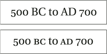
If you select All Caps or Small Caps in an OpenType font, InDesign creates more elegant type. If you’re using an OpenType font, you can also choose All Small Caps from the Character panel menu or the Control panel. (See Apply OpenType font attributes.)
Note
The Sentence Case command assumes that the period (.), exclamation point (!), and question mark (?) characters mark the ends of sentences. Applying Sentence Case may cause unexpected case changes when these characters are used in other ways, as in abbreviations, file names, or Internet URLs. In addition, proper names may become lowercase when they should be uppercase.
You can specify the proportion between the height and width of the type, relative to the original width and height of the characters. Unscaled characters have a value of 100%. Some type families include a true expanded font, which is designed with a larger horizontal spread than the plain type style. Scaling distorts the type, so it is generally preferable to use a font that is designed as condensed or expanded, if one is available.
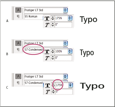
A. Unscaled type B. Unscaled type in condensed font C. Scaled type in condensed font
If the Use New Vertical Scaling in Vertical preference option is selected, the X and Y scale for Roman glyphs in vertical text will be reversed, making all text in the line scale in the same direction. (See Change CJK composition preferences.) If the Adjust Line Height With Char Scale option is selected in the Character panel menu, the Y scale of glyphs affects line height. When scaling frame grids, the Y scale is affected, so you may want to adjust the line height to avoid auto-gyoudori occurring on the scaled grid.
When you change the scale of a frame, the text inside the frame is also scaled. For example, when you double the size of a text frame, the text also doubles in size; 20-point text increases to 40 points.
David Blatner provides an article about scaled text frames at Making a Magnifying Glass Text Frame in InDesign.
You can change a preferences option to indicate how scaled text appears in panels:
By default, with Apply To Content selected, the Font Size boxes in the Control panel and Character panel list the new size of text (such as 40 pt). If you select the Adjust Scaling Percentage option, the Font Size boxes display both the original and the scaled size of the text, such as “20 pt (40).”
The scaling values in the Transform panel tell you the horizontal and vertical percentage by which the frame was scaled. By default, with Apply To Content selected, scaling values display at 100% after a text is scaled. If you select the Adjust Scaling Percentage option, the scaling values reflect the scaled frame, so doubling the scale of a frame displays as 200%.
Tracking scale changes to frames is useful if you have to revert a frame and the text inside it to their original size. It’s useful as well for finding out by how much you changed the size of a frame. To track scale changes to frames and the text inside these frames:
The Adjust Scaling Percentage preference applies to frames that you scale after the preference is turned on, not to existing frames.
The Adjust Scaling Percentage preference stays with the text. The scaled point size continues to appear in parentheses even if you turn off the Adjust Scaling Percentage preference and scale the frame again.
To remove the scaled point size from the Transform panel, choose Redefine Scaling as 100% in the Transform panel. Choosing this option doesn’t change the appearance of the scaled frame.
If you edit the text or scale a frame within threaded frames when the Adjust Scaling Percentage preference is selected, the text is scaled, even if it moves to a different frame. However, if Apply To Content is selected, any text that flows to a different frame as a result of editing is no longer scaled.
